Redesigning Mailchimp's visual editor to simplify and increase campaign creation rates
Click for the summarized version
Overview: Creating an email campaign within Mailchimp is one of the most common tasks that users do when kicking off their marketing campaigns. Designing the email template is one of the most time-consuming parts of the campaign building experience.
My Involvement: I led the design and collaboration efforts for the redesign of the drag-and-drop email template builder.• 130K new users would start a campaign, 110K of which would make it to the editor but not send a campaign. Overall, only 95K sent campaigns.
Challenges: Getting team alignment around "what made a good editor" was a challenge at first given that everyone had their own assumptions.
Outcome: We were able to release the initial version of the drag and drop editor by the end of the year which set us up for extending it over to the website builder.
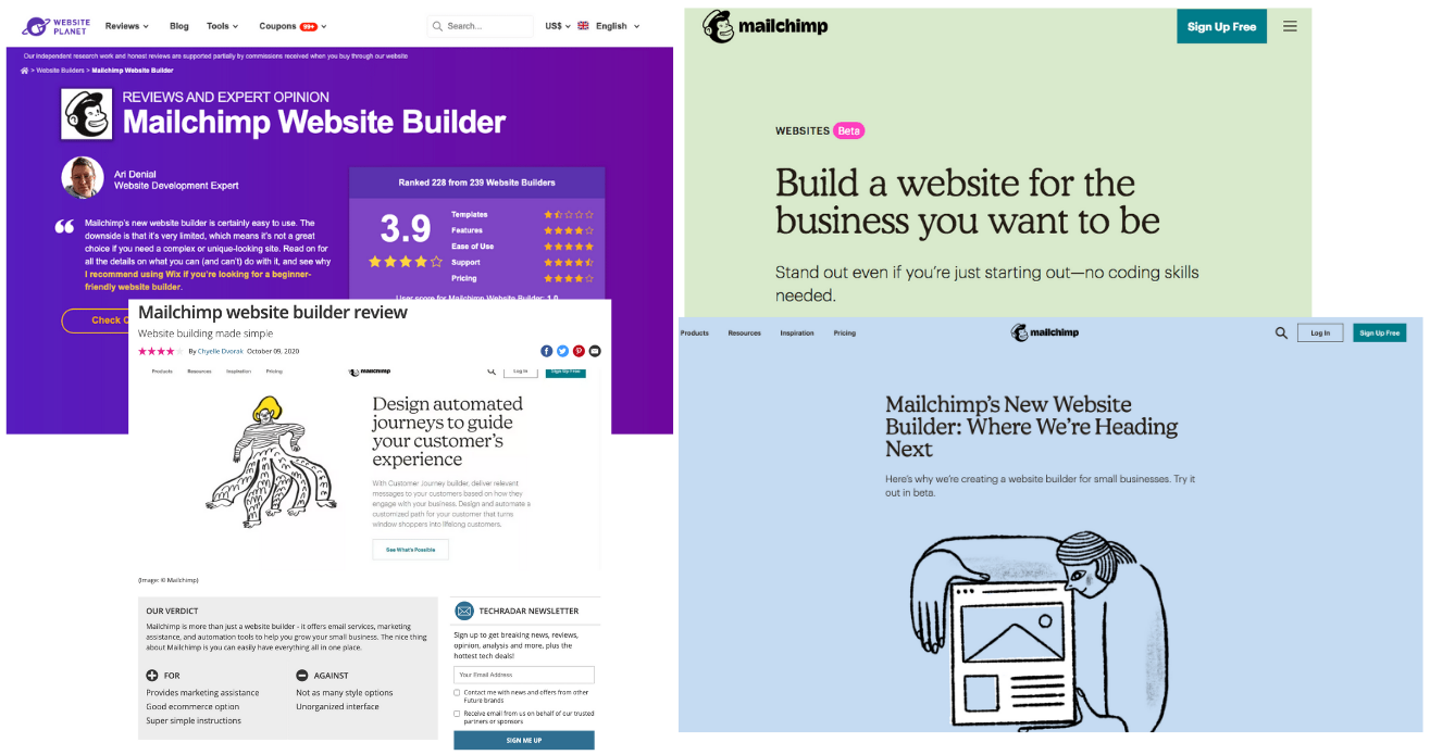
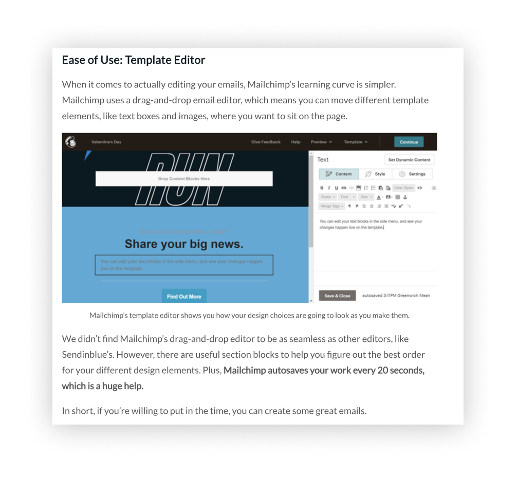
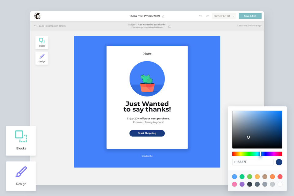
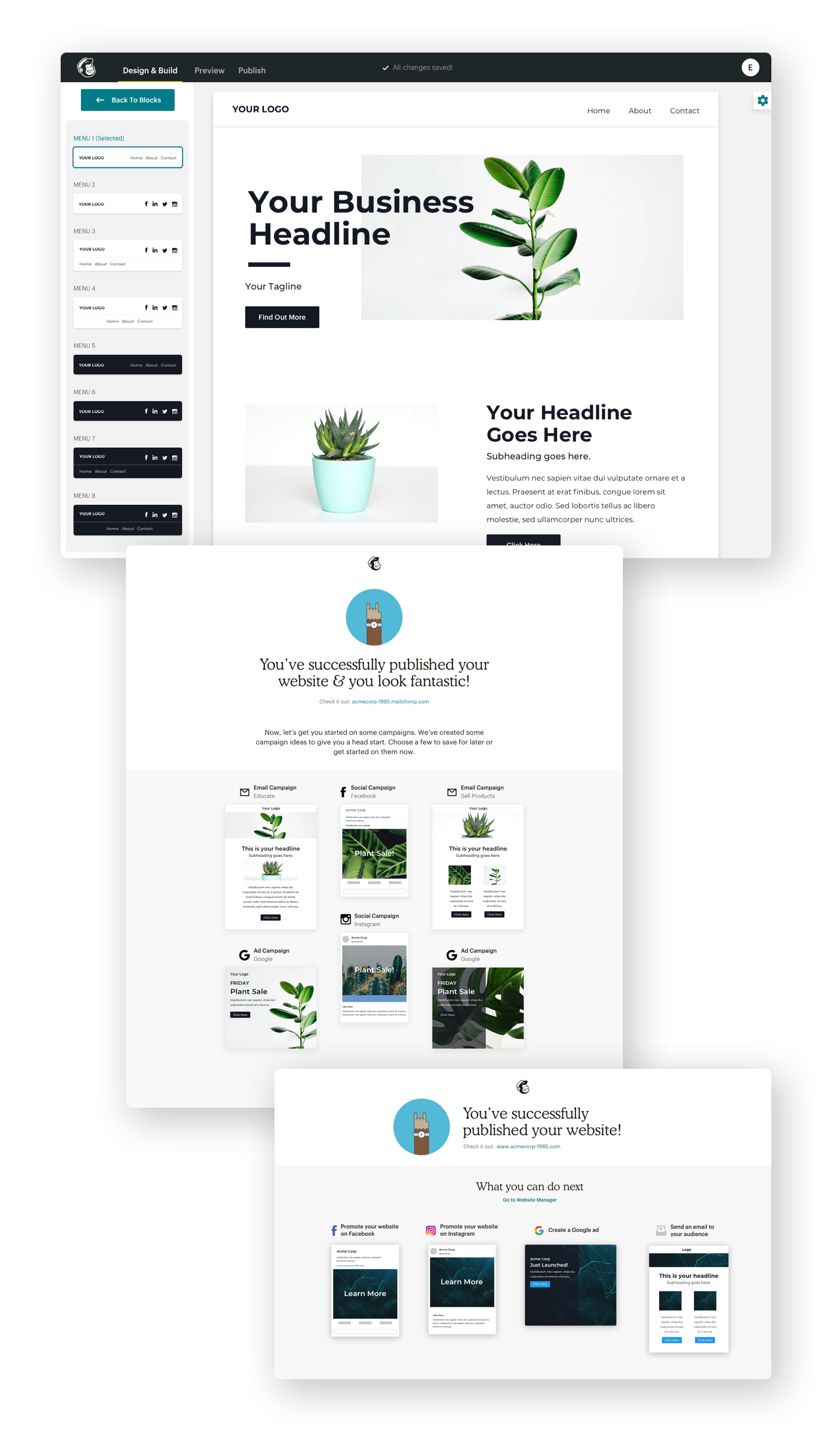
Creating an email campaign within Mailchimp is one of the most common tasks that users do when kicking off their marketing campaigns. The most time consuming part of the campaign building experience is when the user needs to design the email template which consists of styling and adding content. This is all done within Mailchimp’s drag and drop editor.

Our Goals for this Redesign
- Understand and reveal new opportunities for efficiency, conversion and engagement within the overall email experience.
- Identify usability issues and strengths within the overall email experience.
- Elicit actionable insights with clear next steps based on learnings.
What We Planned to Track & Measure
The goal here was to collect enough data where we could connect the dots and tie them back to the overarching KPIs, determine the business impact and surface areas of opportunity for qualitative research methods to further determine “why”.
- Time spent on each page (per URL)
- % Drop-off Rate (From Start) Where? (URL) How does this tie to overall churn?
- Time spent during email creation (Start to Save/Send/Schedule)
- % Email Create Completion Rate (Start → Save, Start → Send)
Our Approach
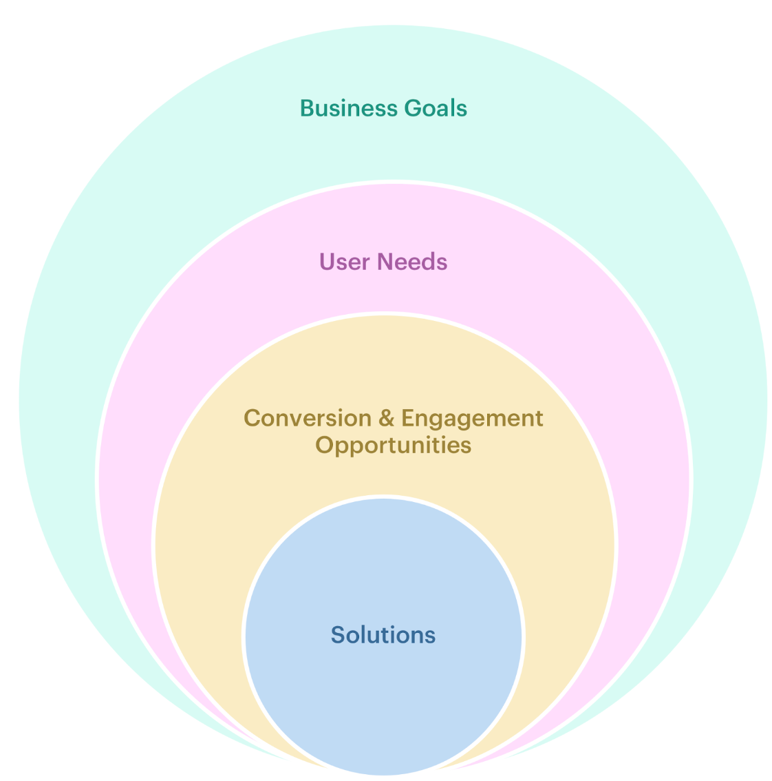
In order to make better informed design solutions, we needed to have a thorough understanding of the entire landscape (research, business, technology, etc.) and how they tie to the editor experience.
- Identify business goals and user needs
- Gather quantitative data
- Personas, jobs to be done and workflows
- Identify issues and strengths
- Understand the competition's offering
- Determine actionable solutions, insights and opportunities
Customer Journey
To get a broad understanding of where this experience lies within the broader journey, we needed to pinpoint the area of focus for more context.
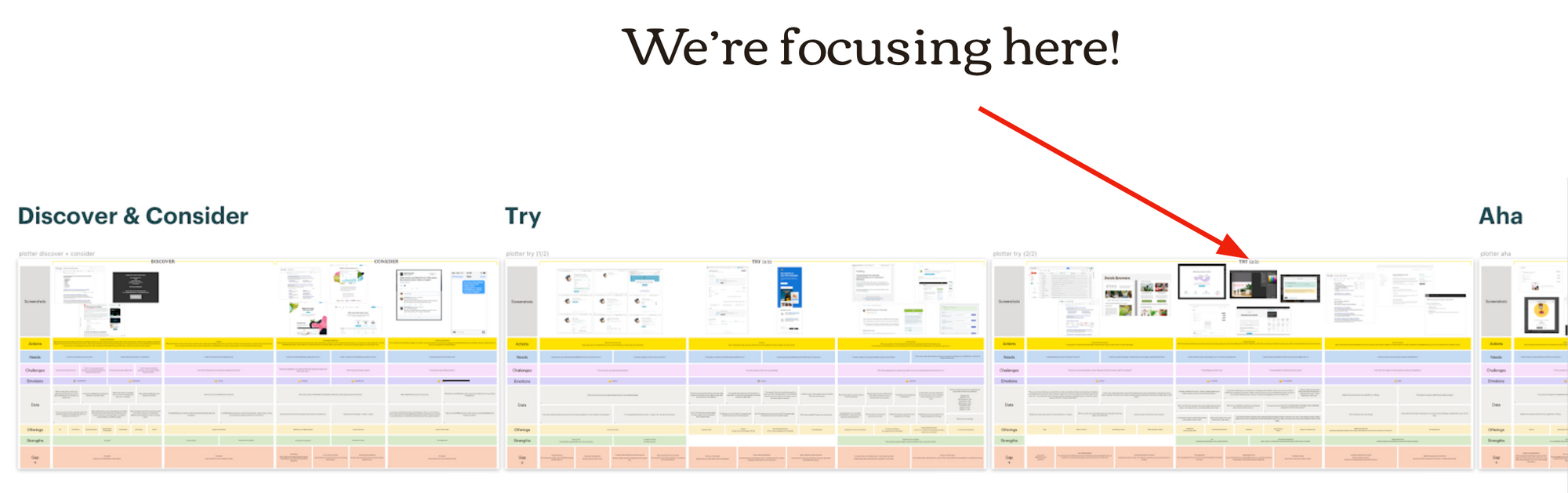
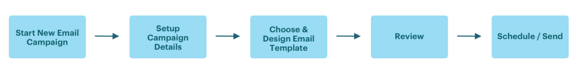
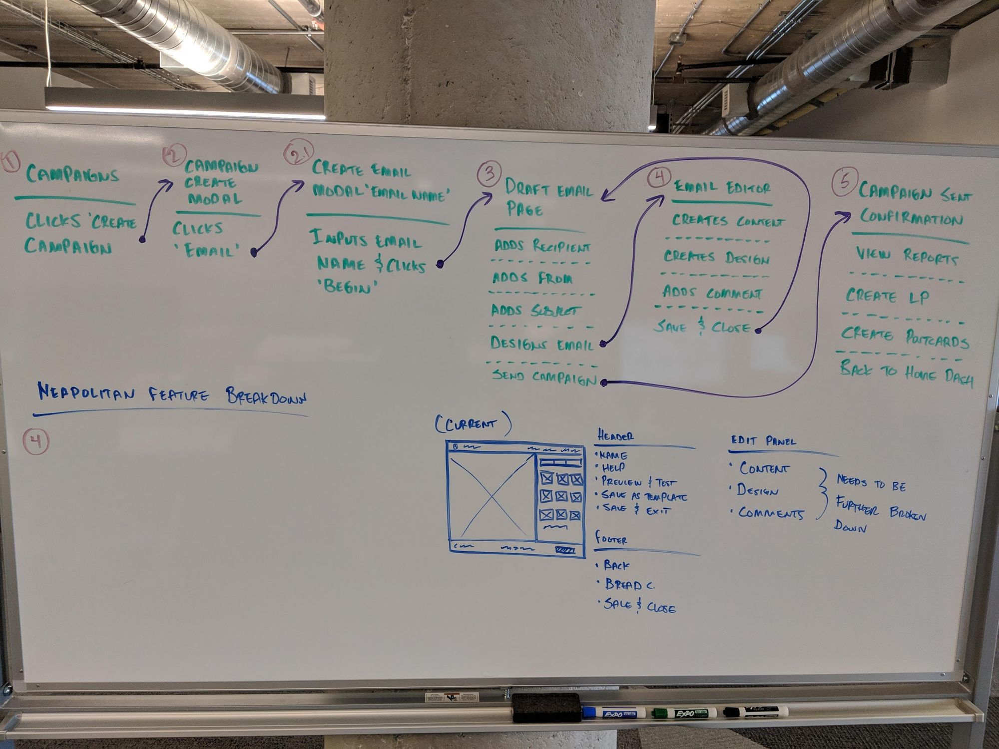
Primary Tasks
UX Evaluation
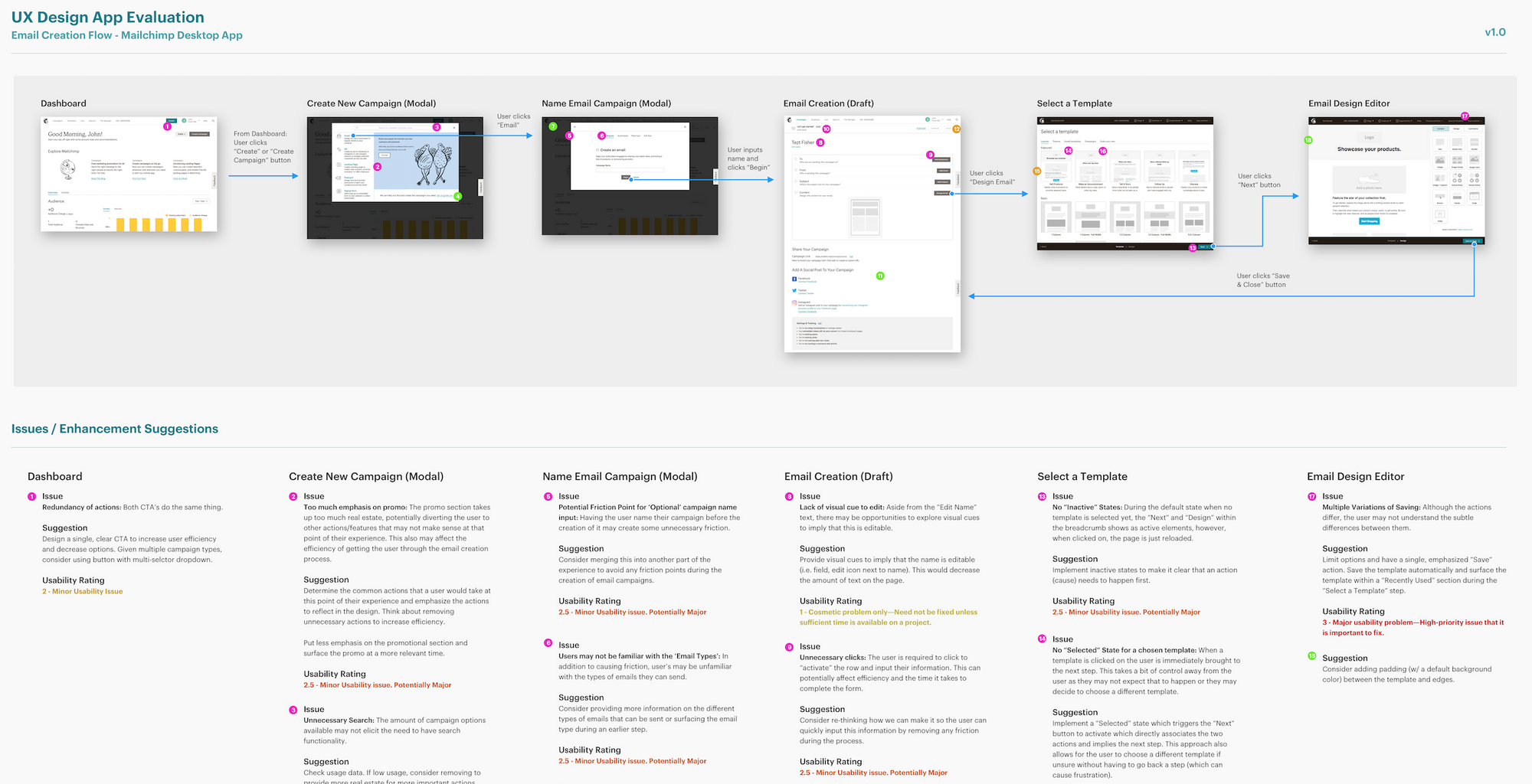
In the effort to better understand what works and what doesn’t within Mailchimp’s existing email creation experience, I conducted a UX evaluation on the desktop application by applying common heuristics based on Nielsen’s 4-point usability scale rating system.
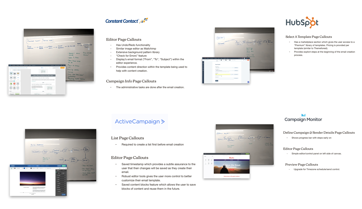
Competitor App Teardown
The goal of this review was to understand the competitive (editor/builder) landscape, what features they provide that differentiates themselves, the overall user experience, patterns, flows and potential opportunities for efficiency, conversion and/or engagement.
Competitors Reviewed
- Constant Contact
- Active Campaign
- Hubspot
- Campaign Monitor
- Canva
- Squarespace
Assumptions Gathering
Going through and compiling the data, I learned that there were many assumptions from the team being made around the reasons why the existing editor could improve in many areas, from a business, technical and UX perspective. In order to get everyones assumptions on the table, I conducted a quick, 45-minute assumptions gathering workshop to gain better alignment across the entire team. Gathering and discussing assumptions from the entire cross-functional team created a natural space to debate and prioritize the areas where we wanted to focus.
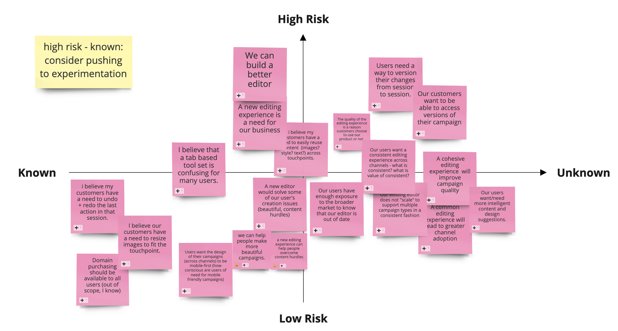
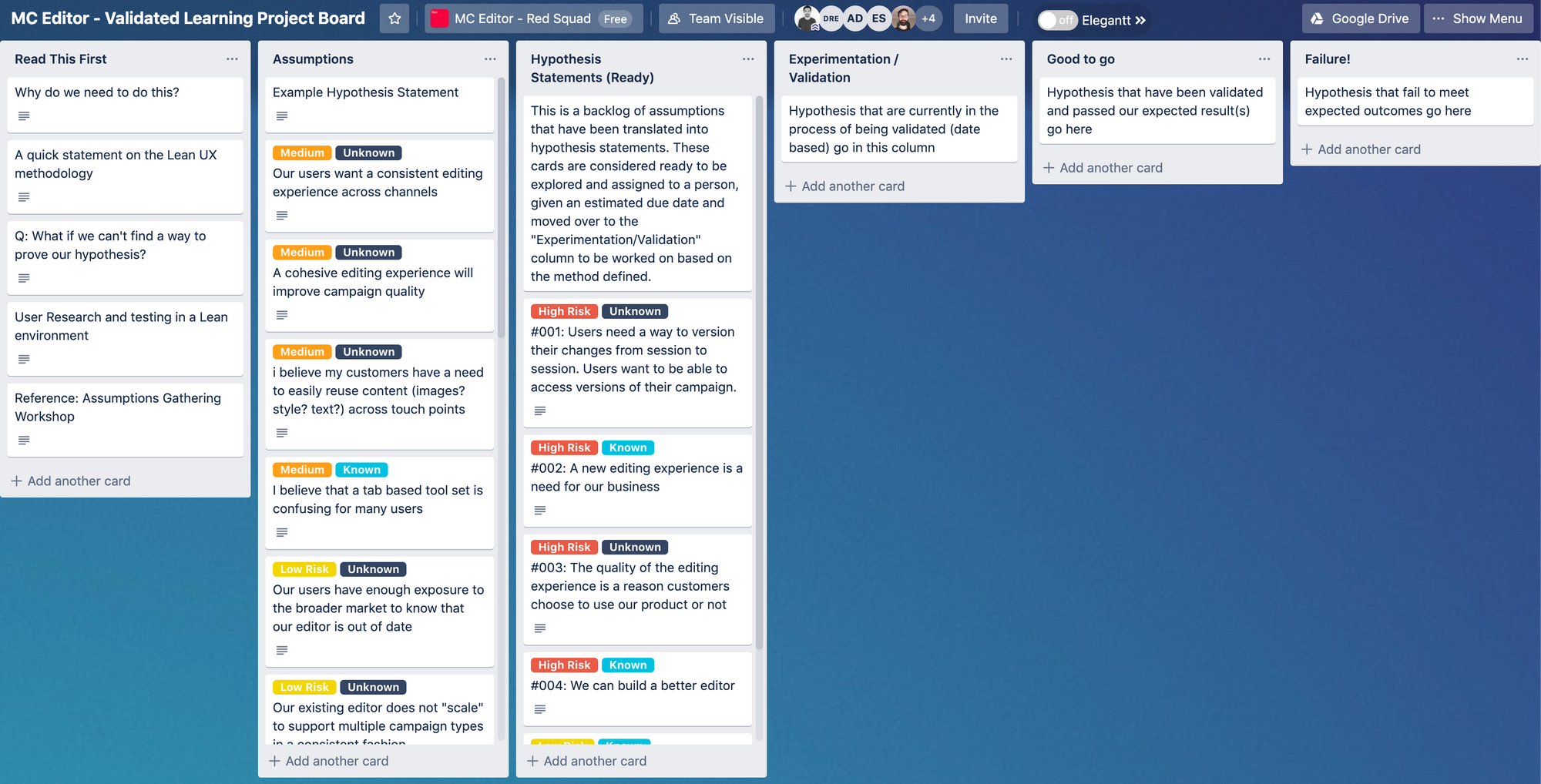
Validated Learning
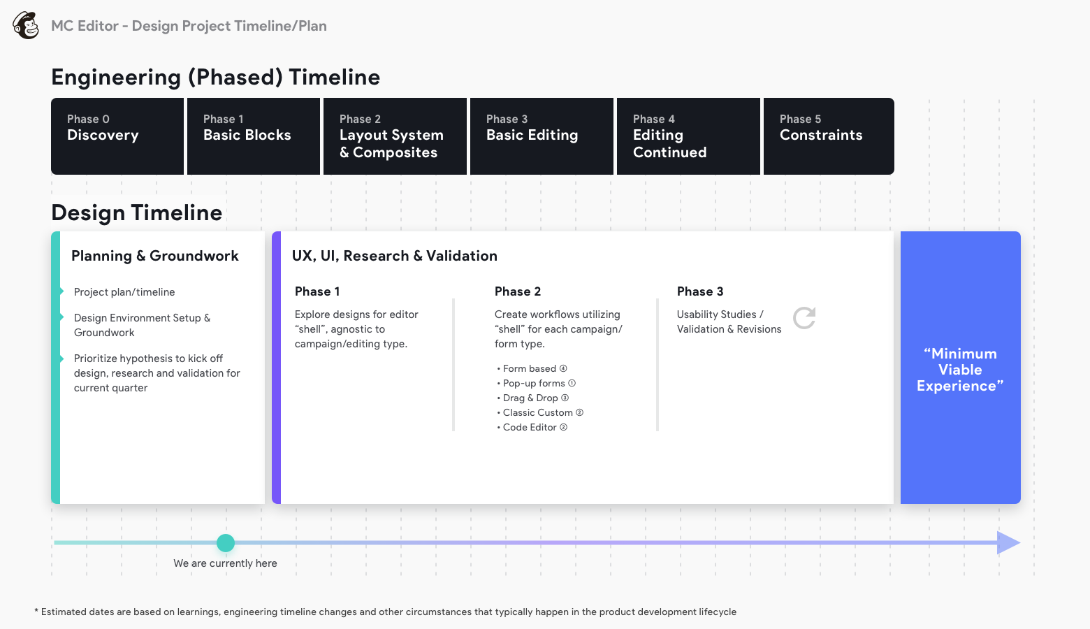
Upon completing the assumptions gathering workshop, I worked with our researcher to move all of our assumptions over to a validated learning framework that would act as the design/research project board. This allowed for us to prioritize research and design work during the early discovery phase. We decided to initially focus on validating all of the riskiest, unknown assumptions first. In addition to planning for experiments, I had also created a phased timeline to match the ongoing engineering efforts in parallel.
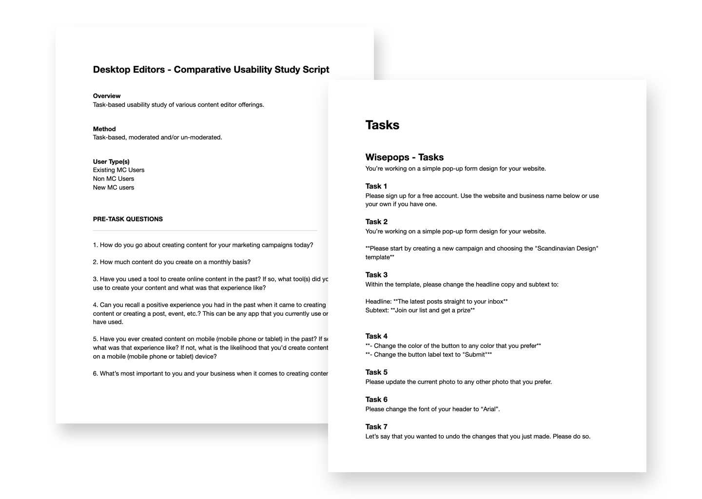
Comparative Usability Studies
From all the assumptions gathered, some common themes included keywords like “Modern”, “Quality”, “Out of date”and “We can build a better editor”. Initially, those assumptions could have been considered subjective and difficult to define measurable outcomes for. As a starting point, we needed to create our own standards of what “Modern” or “Better” actually meant, create a baseline to measure against and then compare.
To create that baseline and to get a deeper understanding of how users interacted with various editing experiences we conducted several usability studies, running each user through simple tasks that have specific, measurable outcomes. This allowed for us to explore how those concepts were received by real people trying to accomplish a task. This insight helped us to determine what interactions and patterns performed well (across several offerings), which in turn helped to inform what we can potentially utilize in our redesign.
Using Validately, we conducted several unmoderated, task-based studies with five users for each competitive offering (totaling 20 different users). The study focused on:
- Task Success – Can the user complete the given task? (Task completion)
- Time on Task – Can the user complete the given tasks in a reasonable amount of time?
- Usability & Ease of Use – Are the features/functionality required to get a job done easily discoverable and usable?
- % Email Create Completion Rate (Start → Save, Start → Send)
From these learnings, we were be able to speak more about:
- Overall success of concepts
- Surface opportunities of where to test further
- Create our own prototypes inspired by what we learn
Comparative Usability Study Themes & Takeaways
Inline Editing
Unless there is a clear correlation between the active section and a separate panel to make edits to said section, the inline editing approach made sense and was straight forward for a majority of users.
3 out of the 4 editors tested offered inline editing
- Squarespace
- Canva
- Wisepops
Some issues observed
A few users had issues with “activating” a section to edit. In the clip below, notice that he clicks the section and begins to type. He eventually double clicks to highlight and then begins to update the copy.

Text labels to compliment iconography
Provide clear labels for section names and section actions. Sometimes relying solely on iconography will not be clear enough and will need to be accompanied with text. There may be an opportunity here to utilize progressive reduction.

Clear Labels for Improved Association
Clear visual indicators or copy for better associating active sections to editable panels (if not going the in-line edit approach). This is intended to help users immediately correlate the active section to the editable panel. Additionally, provide real-time updates on the template as the user is updating copy, images, etc. on the editable panel to provide the user with immediate feedback on their changes.

Modular, pre-built section options
If going with this approach, train the user early on on how to interact/do this. Also be mindful of not providing too many options for each category of sections. This approach works best when there is a clear blank state template as that’s typically utilized to provide a clear call to action. This may conflict or compliment a template approach depending on its complexity.
Proximity of actions
Think about the placement and proximity of actions such as when editing a section, making sure that the user can easily associate it to where they can update it (Ex: Changing the font for a specific header or paragraph). On some tests (such as Canva – changing font) the user was not able to associate a highlighted snippet of copy to the toolbar as it was not within close proximity (see Fitt’s Law as it somewhat is relevant to this). Consider more in-line approaches to formatting options.
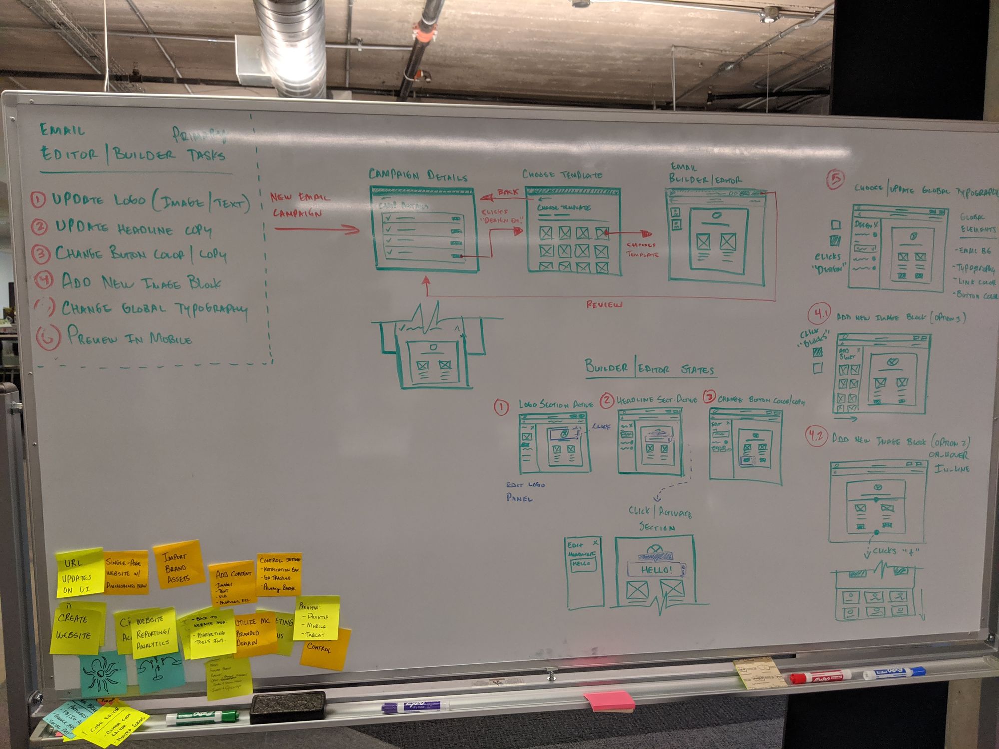
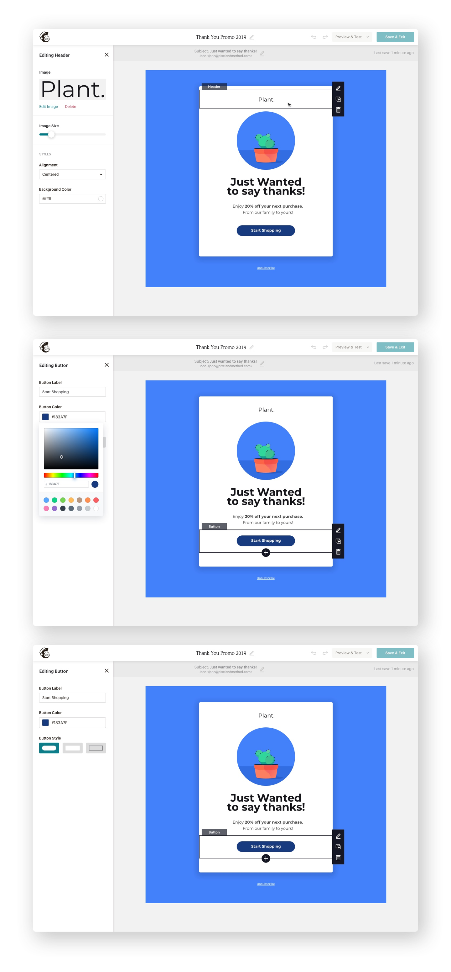
Design Concepts & Explorations
Outcome
Mailchimp’s editor 2.0 framework is currently in Alpha (Dec 2019). Aside from the explorations and testing of design approaches, the development team will continue to work towards refactoring and overhauling the front-end framework as well as instrumenting/optimizing analytics to better track and measure traffic and user behavior. During this time the team will continue to learn and iterate to the final solution as well as explore the end to end campaign builder experience, saving content blocks and recommendations.